Partnerships in Geospatial Problem-Solving
The Center for Geospatial Analytics is celebrating the December 2019 graduation of eighteen professional master’s students in Geospatial Information Science and Technology (MGIST)! During their final semester, each student in the MGIST program works with a community partner to apply their knowledge and skills to a real-world problem in a service-learning capstone project.
This semester, projects ranged from improving accessibility on campus and on the web to examining pollution in drinking water and downstream from farms, predicting when water main pipes will fail, tracking changes in a dynamic coastline…and much more!
Read on for a glimpse into the impactful work of our professional master’s students.
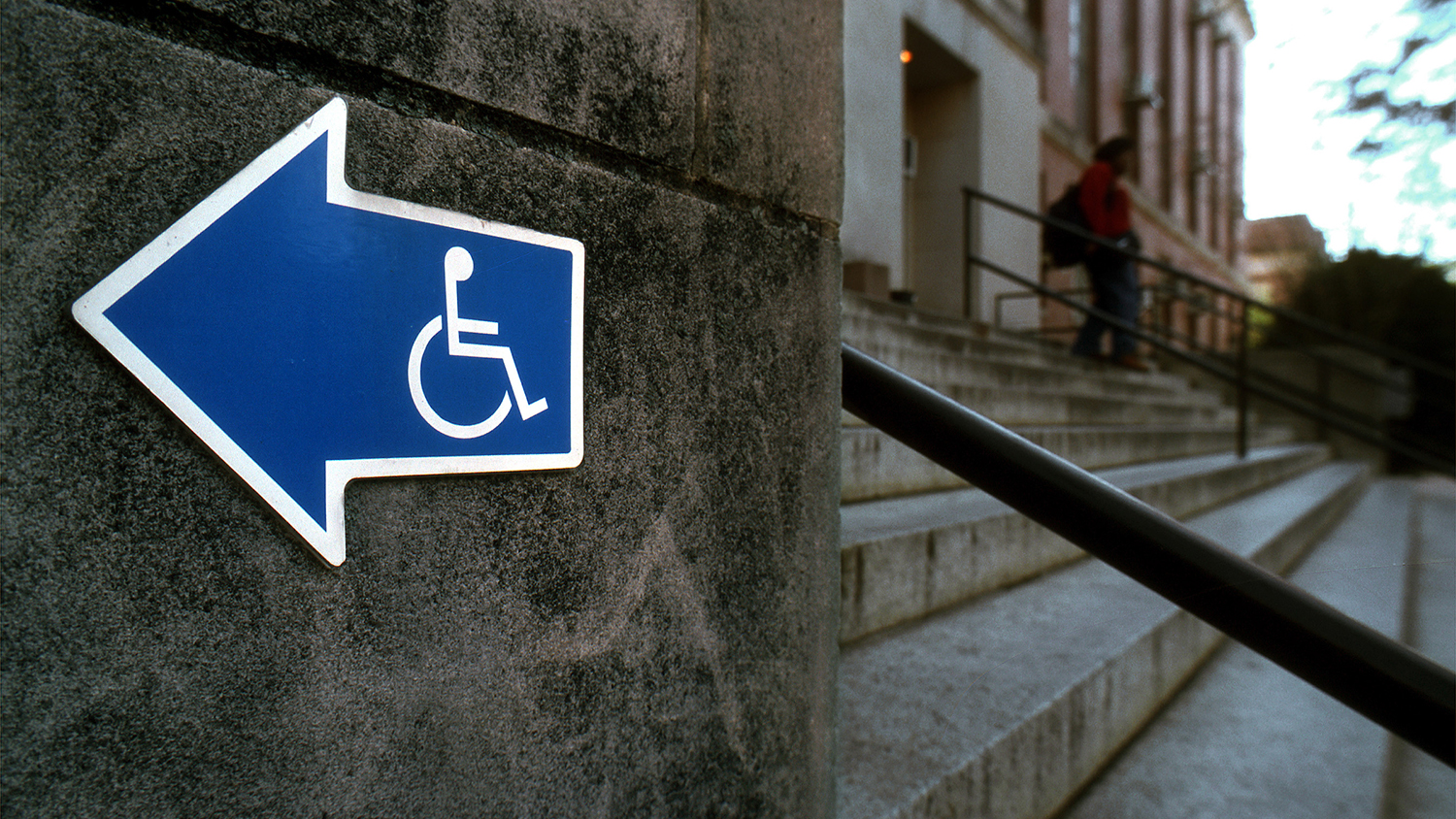
Navigating NC State by wheelchair
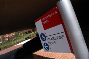
Common wayfinding apps like Google Maps and Apple Maps are great for navigating city streets on foot, but they don’t account for stairs, high curbs or other features problematic for people with disabilities.
To address this problem on NC State’s campus, MGIST student Daniel Oberrender partnered with the Outreach, Communications and Consulting unit of NC State’s Office of Information Technology (OIT-OCC) to build a prototype web mapping application that can provide accessible wayfinding. The purpose of the collaboration was to “use the power of geospatial information science and systems to improve accessibility for NC State University students, faculty and guests,” Oberrender says.
The app he developed uses NC State University Accessibility Mapping Project data from 2015 to identify accessible paths, ramps and facility entrances, as well as Wolfline bus stops. For this initial test, he limited the study area to the North Campus boundary. The app calculates the “least cost path” between selected start and end points, determining the shortest and fastest routes based on average wheelchair speed.
In future versions, he says, “cost attributes can be created to serve different types of disabilities and travel modes, providing even more inclusiveness…[beyond] a manual wheelchair.”
His project partner, Crystal Tenan, team leader of University IT Accessibility Services, underscores the importance of this type of work: “This is really helping us take another step forward,” she says, “because no one is doing this well. We’re really trying for NC State to lead the way…and we want to be as inclusive as possible. We want all of our students and faculty and staff and guests to be able to get around easily.”
Increasing accessibility of interactive maps

Under Section 508 of the Rehabilitation Act, all websites and other electronic content provided by federal agencies must be accessible to persons with disabilities––including web maps. Complex, interactive web maps are difficult to make 508 compliant, though, and so they rarely are. Aspects of web accessibility include image text alternatives and set languages for screen readers, easily navigable structures, keyboard navigation that can replace a mouse and good color contrast.
MGIST student Colleen Lippert tackled this problem by seeking to retrofit a popular web mapping application for Shenandoah National Park called “Exploring Park History,” created in partnership between the MGIST capstone program and the National Park Service over the past several years.
According to online tools that can test website accessibility, the existing app had an accessibility rating of 74%; Lippert was able to bump it up to 80%. “I wasn’t able to make it fully accessible,” she says, “but I was able to get a modest increase in the accessibility rating just by manipulating the theme, widget placement and color contrast.” Her version of the app also provides image thumbnails in popup windows, making it easier to quickly examine historical documents associated with different locations in the park.
“I couldn’t find a federal example of [an accessible] map application,” Lippert says. “You’d have to actually edit the code [of the geoprocessing tools] to make it accessible.” She will report her findings to a greater number of National Park Service officials, so that this obstacle can be addressed at the agency level.
Examining PFAS distribution in drinking water

For the past year, the North Carolina PFAS Testing Network has been collecting drinking water and air samples across the state to test for human-made per and polyfluoroalkyl substances (PFAS), including the chemical GenX. A collaboration between universities across NC, the network comprises seven research teams—one of which is the “Data Science & Management Team,” co-led by the Center for Geospatial Analytics’ associate director of geovisualization, Helena Mitasova.
MGIST student Blake Baines worked with Mitasova and her team to create a web mapping application that visualizes the more than 400 locations that have been sampled for drinking water; the app may also help identify potential sources of PFAS pollution.
“We really wanted to make an application to organize all of this data into one viewable interface that the PFAST Network scientists could view,” Baines says. “This application is basically for them to visualize and query and then [use to] try to figure out and narrow down spatially where potential pollution point sources may be, given what concentrations are in certain areas.”
To accomplish this, Baines mapped the locations of drinking water samples and the areas served by each associated public water supply; he also performed a hydrological analysis to determine the areas that would drain runoff into each sampling location. “So what you have here,” he explains, “is where the surface water is coming in, where it was sampled, what the concentration is at that point, and where it’s being distributed out.” For now, his web app uses simulated data, rather than actual measured concentrations.
Assessing the impacts of crop buffers on nutrient runoff
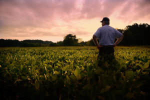
Strategies that keep soil and nutrients from washing away from agricultural fields are important for preserving water quality downstream and conserving valuable resources that growers apply to their crops. One strategy is to plant a border of deep-rooted, sturdy vegetation like switchgrass around fields, to keep soil and nutrients with the crops where they belong.
To better understand how such vegetative barriers can impact nutrient discharge from fields, MGIST student Shannon Veraldi worked with Center for Geospatial Analytics postdoctoral scholar Kunwar Singh to model how water pollution might change with changes in land use.
Specifically, Veraldi used the Soil and Water Assessment Tool (SWAT) to explore what would happen if all soybean fields exceeding six acres in the Neuse River Basin were each buffered by a 25-m border of switchgrass. “There are over 200,000 acres of soybean fields in the Neuse River Basin, so this was a relevant crop to be looking at,” Veraldi says.
Her analysis showed that surface water levels of nitrogen, phosphorus and sediment all decreased with the addition of the simulated buffer. She created web mapping applications and a story map to visualize the results.
“I created a story map to be as educational as possible to non-agricultural professionals who wanted to learn more about vegetative barriers and land use changes and how they can have an effect on discharge levels,” Veraldi explains. “It also discusses what SWAT is and why it’s important, and the resulting data for this analysis.” Future work, she says, could explore different types and sizes of vegetative barriers as well as their economic value.
Predicting the failure of water mains
A burst water main is something every water utility hopes to avoid. Unexpected pipe failures are damaging and costly, and can leave customers without service for indefinite periods of time.
“The best way to manage a water main failure is to be proactive, rather than reactive,” says MGIST student Joel Conrad. That’s why he partnered with Winston-Salem Forsyth County Utilities to develop a web mapping application that can predict where and when water pipes in their jurisdiction might give out.
“The purpose of this project was to produce an accurate measurement that will predict how long a given water main will last,” Conrad explains, “and the goal was to give [the client] the ability to [respond] proactively to water main failures.”
Conrad used information about past water main failures––including pipe length, diameter and age, plus soil type, pipe type and pressure zone––in a machine-learning algorithm to generate predictions of future failures. The web mapping application he developed flags potential failures by date across the service area of the utilities. He also created an “operations dashboard” to visualize expected failures by year, pipe material and more. Another tool he developed called “How long will a water main last?” allows the user to plug in values for pipe length, age, material, diameter, etc. and get a prediction for the pipe failure date.
All of this work provides the Winston-Salem Forsyth County Utilities with “an idea of where and when water mains will fail and allows them to…be more proactive when it comes to this type of issue in their system,” Conrad says. “In addition, this [tool] can become part of the workflow of the organization, where locations [of expected failures] can be included in a work order given to the crews; as they go out to repair one main, they can go check another main that may be close by.”
Tracking changes in a dynamic coastline
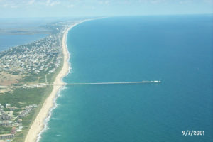
Sandy coastlines are famously dynamic places, as currents, constant wind and wave action and regular coastal storms mold the seafloor and dunes. On the Outer Banks of North Carolina, in the town of Duck, the US Army Corps of Engineers’ Field Research Facility (FRF) has been collecting information about the region’s shifting sands since 1989. But how to visualize the changes?
MGIST student Michael Forte is a beach and nearshore mapping specialist at FRF and partnered with his employer to create a web mapping application that displays interpolated data from 233 coastal surveys over nearly 30 years. The app also allows users to plot elevation over time at any particular spot in the survey area.
Forte’s work illustrates the “dynamic nature of these sand bars,” he says, especially around human-made structures like the pier, and “allows researchers [to do] rapid analysis and plotting within the survey domain,” which reaches from the base of the dune to about eight meters offshore.
Overall, between 1989 and 2017, the dune has grown shallower, and water depth offshore has deepened. Future work, Forte says, could explore the relative contributions of wave power versus storms to these changes.
And more!
Several MGIST capstones this semester expanded on the work of students in previous semesters:

Calaen Wilson built on the work of a May 2019 graduate to create a web mapping application for the Recovery Alliance Initiative, to help North Carolinians suffering from substance use disorders (SUDs) find the treatment resources they need. In addition to creating a web mapping application that displays the location of 12 Step and other support groups, housing, advocacy organizations and more, Wilson developed a web-based survey that the Recovery Alliance Initiative will continue to use to gather more updated information about resources across the state. “Spatial knowledge of SUD resource accessibility can have great long-term impacts on communities and individuals,” Wilson says.
Elizabeth Robinson partnered with Center for Geospatial Analytics faculty fellow Bethany Cutts (Department of Parks, Recreation and Tourism Management) to follow up on work from May 2018 exploring the potential for hurricane flooding to increase exposure to environmental hazards. Robinson developed a web mapping application that spatially depicts the levels of E. coli, arsenic, cadmium and lead measured in soil samples collected from areas in Robeson County flooded by Hurricanes Matthew (2016) and Florence (2018). Despite variability across the landscape, all measured levels were below thresholds for concern. “For a community that’s used to being stigmatized as high hazard and high poverty, seeing that they’re below the threshold has actually proven to be very empowering,” says Cutts.
Several more students worked with researchers and faculty at NC State:
Xena Hong partnered with Center for Geospatial Analytics research associate Okan Pala on a project supporting the North Carolina Department of Transportation’s (NCDOT’s) efforts to expand participation in public meetings about new proposed roadway projects.
Michael Caslin worked under the guidance of associate professor Madhu Katti (Department of Forestry and Environmental Resources) to spatially display the latest results from the Triangle Bird Count; his web mapping application also can help other citizen science projects generate randomly distributed sampling points.
Both Tamika Brown and Madeline Pope Fetterman collaborated with Center for Geospatial Analytics postdoctoral scholar Kunwar Singh to explore the reliability of different methods for spatial data collection. Brown evaluated the optimal number of ground control points needed to ensure the spatial accuracy of imagery collected by drone-mounted cameras; Pope Fetterman compared techniques for estimating forest biomass in urban areas using high-resolution lidar data.
Additional projects supported industry, government agencies and nonprofit groups to further their missions:
Working with his employer on NC State’s Centennial Campus, John Cummings helped the consulting company VHB establish a replicable and user-friendly protocol for managing and updating its vast trove of spatial data.
Tom Koch built a web mapping application to assist foresters employed by the North Carolina Wildlife Resources Commission (NCWRC) “see where areas within their region are optimal for future prescribed burns.” Benjamin Colia also worked with NCWRC, creating a web mapping application that will help the agency track changes in public access to private lands participating in the Public Mountain Trout Waters program.
In collaboration with NCModernist / USModernist, Eli Heetderks created a GIS database to help the non-profit digital archive store and display its huge amount of data about residential Modernist architecture.
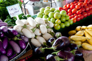
Guillermo Valenciano and Sandi Watkins both worked with the North Carolina Alliance for Health to help the nonprofit visualize wellness data. Valenciano created interactive maps that display the prevalence of obesity, diabetes and physical inactivity over time; Watkins developed a web mapping application to explore the prevalence of “food deserts” in the state and visualize access to food retailers that participate in the Supplemental Nutrition Assistance Program (SNAP).
Congratulations to all of our graduating MGIST students on their success!