Visual Identity
Review this section to better understand guidelines and rules related to the College of Natural Resources’ visual identity.
College of Natural Resources Logos
Only approved versions of the NC State College of Natural Resources logo should be used on all core brand communications. The College of Natural Resources has chosen two primary versions, horizontal and stacked, to be the consistent signatures for the college. The logotype on one line without the brick may be used as well. Use the appropriate configuration for your project. Departments and smaller entities within the college may not create or use logos.


Guidelines:
- Use only the official College of Natural Resources logos. Download here.
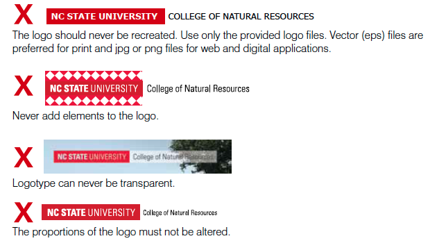
- Do not alter, embellish or adjust the portions of the logos.
- Logos should be used at 100% opacity, without gradients or drop shadows.
- Do not crowd the logo. When placing the logo, use the height of the letter N in the logo as a visual reference; design elements, type and photos should be that distance from the logo. See below.

Incorrect Logo Usage
Retired and Unacceptable Logos
- Historical logos for the College of Natural Resources, its departments and center have been retired.
- Departments and smaller entities within the college may not create or use logos.
- The chancellor’s seal may only be used on chancellor’s office communications, graduation materials, official university certificates and awards.
- Block S logo is reserved for university athletics and student groups.
- Mr. Wuf should not be used as a logo mark.







Logos representing departments, individual programs or groups within the college are not permitted.

The college logo may not be altered to include department names or other information.
Typography and Fonts
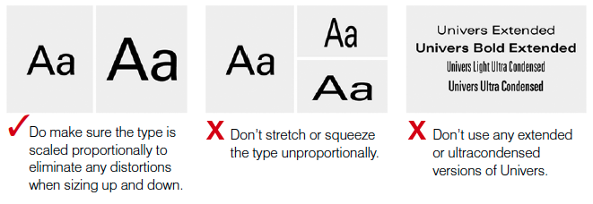
NC State’s primary typeface is Univers. Univers is a broad font family, and University Communications has obtained site licenses for many of the faces within the font family.A limited number of licenses for Univers are available, free of charge, to professional communicators across campus who agree to use them within brand parameters. If you are interested in receiving a license, contact the brand administrators at ncstatebrand@ncsu.edu.
Substitute Font: If you do not have a license for Univers, the primary substitute typeface is Arial. Arial is acceptable for use in presentations, HTML emails, native apps, and Word documents.Guidelines:
- Use no more than two or three font styles and a limited number of type sizes.
- For body text in print, use light weights (8.5 pt+ font size and a 130% or 160% leading proportion). For body text on the Web, use roman weights (14 px+ font size and a 130% or 160% line-height proportion).

Color
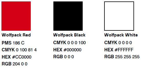
NC State’s core palette consists of three colors: Wolfpack Red, Wolfpack White and Wolfpack Black. These colors should feature more prominently than any other colors in all College of Natural Resources communications. We are, always, the Red and White of NC State. The expanded NC State Brand color palette offers additional colors may be used as secondary accents within a design.
Guidelines:
- Even when used sparingly, Wolfpack Red should always come across as the dominant color in all designs.
- Departmental and other colors from the expanded pallet should always remain secondary to our primary colors of Wolfpack Red, Wolfpack White and Wolfpack Black.
- Color fields should always be used at at 100% opacity, without gradients or drop shadows.
Primary colors:
Imagery
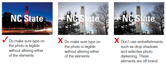
College of Natural Resources images should be big, bold and impactful. Photography and video should reflect momentum, optimism, and the gravity and world-changing potential of our work. For a full catalog of downloadable on-brand photography, visit the university’s PackPix page.Guidelines:
- Consider image content. Always give thought to what is purposefully featured in the images. This means both the main subject matter and the other elements in the foreground, middle and background.
- Use a singular image, and make your image’s purpose clear. Focus on a specific subject. Avoid image collections or collages and group portraits.
- Use unique perspectives in photography. A different perspective, literally and figuratively, describes life at the College of Natural Resources. Try getting up higher to give a bird’s-eye view of your subject or drop down low to present your primary subject as an audacious agent driving innovation.
Design Conventions
The philosophy behind our design conventions is to let the content speak. Our communications should be clean and purposeful. Legibility and simplicity should be the essence of all design. The College of Natural Resources is a modern place of hard edges and practical thinking. Our design philosophy follows the focus on what’s real, tangible and impactful. Do not distract from the core message with design flourishes.Guidelines:
- Design on a grid. To reflect our personality and brand platform, use blocks, grids and structured elements.
- Keep it simple. The intentional use of negative space and minimal embellishment will enhance your audience’s ability to understand your message.
- Use large headlines and short, direct copy.
- Organize large amounts of information into bullet points to make it more accessible.
- Color fields should be used at 100% opacity, without gradients or drop shadows.
